

Quick review for you: For mid century modern kitchen lighting, choose pendant lights with simple silhouettes, warm brass or black metal details, natural wood or woven accents, and a scale that matches the island or dining area. In our experience with kitchen lighting design, including Rowabi Lighting pieces, the strongest fixtures balance modern form with organic warmth rather than relying on decoration alone.
The kitchen is one of the most underconsidered spaces for thoughtful pendant selection. Too often, it becomes the last room to receive design attention, and fixtures are chosen for convenience rather than character. But in a mid-century modern kitchen, the pendant light is as much a design statement as the cabinet hardware or the countertop material. Get it right, and the fixture anchors the entire room. Get it wrong, and even the most carefully considered kitchen reads as unfinished.
For homeowners comparing clean silhouettes, warm finishes, and natural textures, contemporary pendant lights from Rowabi offer a useful reference point for seeing how modern pendant forms can work in kitchens without making the space feel cold or overly themed.
What Makes a Pendant Light Feel Mid-Century Modern?
A pendant reads as mid-century modern when it distills a strong idea into a clear, resolved form, nothing superfluous, nothing decorative for its own sake.
The hallmarks are well established: globe and dome shapes inspired by the machine age and space-race optimism; cone shades borrowed from industrial task lighting; saucer and mushroom forms that feel sculptural. What unites them is an absence of fussiness. Mid-century design at its best is not minimal. It is precise. There is detail, but it earns its place.
Materials tell the same story. Warm brass was the metal of the era: polished, unlacquered, developing a patina that spoke to quality and age. Matte black offered contrast without ornament. Warm woods, such as walnut, teak, and oak, grounded the harder materials with an organic quality. More recent interpretations have added woven natural fibers to the palette, which sit comfortably within the mid-century vocabulary when the shade’s silhouette remains clean, and the hardware stays warm.
This is where craftsmanship matters. A mid-century modern pendant light does not need to feel mass-produced to feel modern; it simply needs a clear shape, honest material, and balanced construction. For readers who care about how a fixture is made, The story of a Rowabi Light gives helpful context on the brand’s approach to handcrafted lighting, natural materials, and considered proportions.
The test for any pendant: does it have a point of view? Mid-century design always does.
Best Places to Use Mid-Century Pendants in the Kitchen
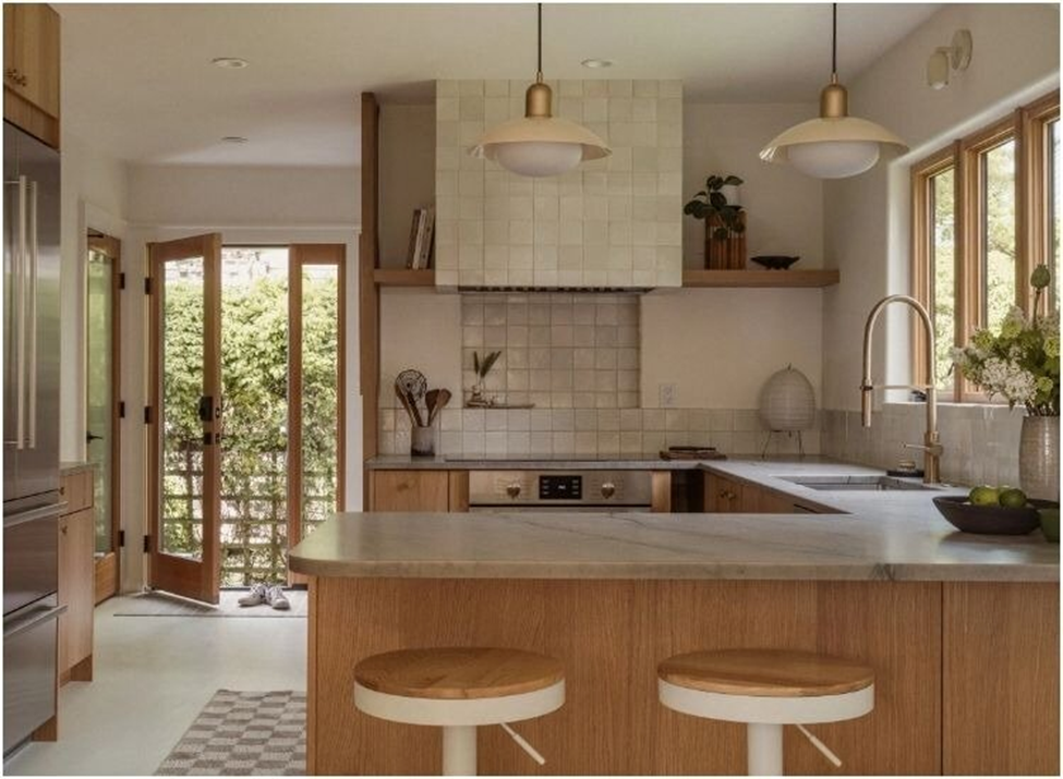
Kitchen Island
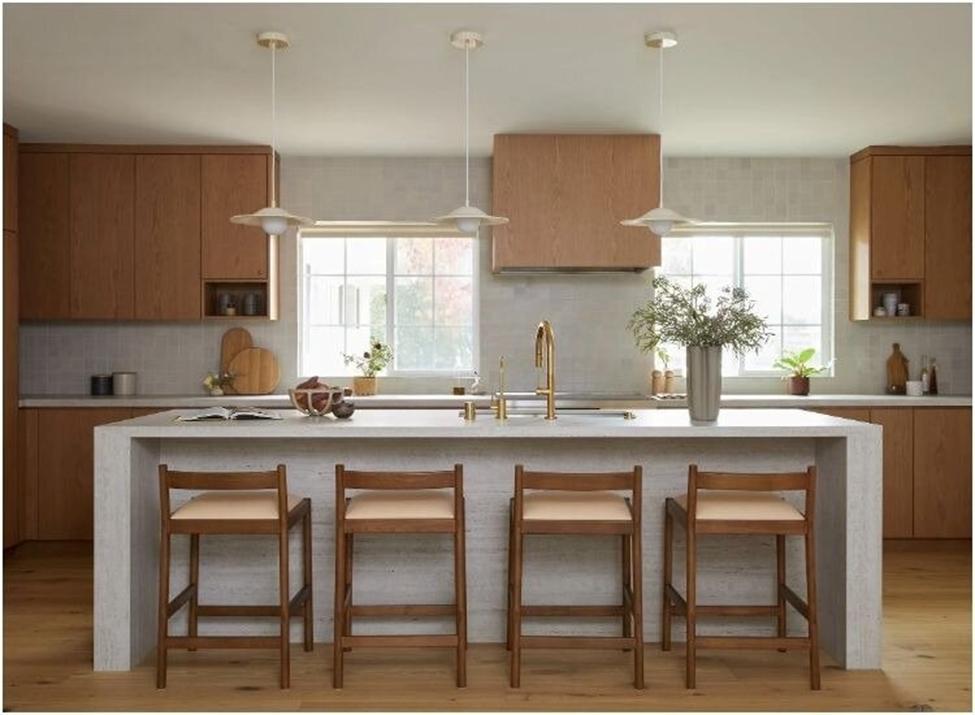
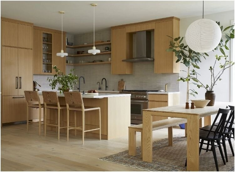
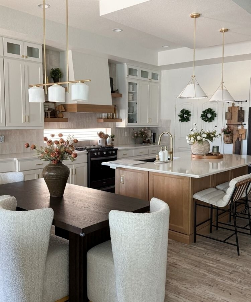
The island is the natural home of a statement pendant in a mid-century kitchen. Whether you’re working with a single large globe or a row of smaller cone shades, the island offers the horizontal surface and visual clearance that makes pendant placement feel resolved. The fixture should feel as if it were always part of the kitchen’s architecture, not added afterward.
Sink
A single pendant over the kitchen sink is one of the most quietly effective mid-century gestures. It provides task lighting where it’s needed and creates visual interest at the perimeter of the kitchen rather than concentrating everything at the center. A cone shade with a warm brass arm reads particularly well here: directional, purposeful, confident.
Breakfast Nook and Dining Corner
The informal dining area within an open kitchen is where mid-century pendant design can be most expressive. A globe pendant centered above a round table, a saucer shade over a banquette, or a pendant with an exposed Edison bulb above a wood-topped table, all of these create a defined, intimate zone within a larger open space. The pendant draws the eye and signals that this corner is for something other than cooking.
Open-Plan Divider
In open-concept homes where the kitchen flows into the living or dining area, a row of pendants above the island or counter serves as a visual partition, marking the transition between zones without walls. A linear arrangement of matching pendants in a mid-century finish creates structure in the absence of physical separation.
Popular Pendant Shapes for a Mid-Century Kitchen
Globe
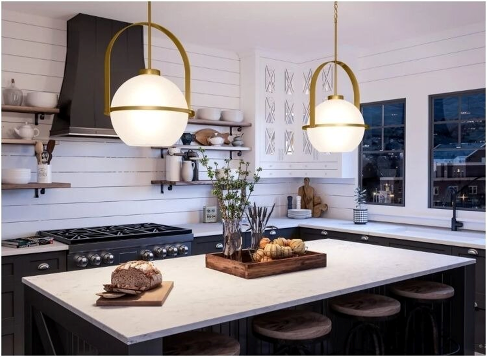
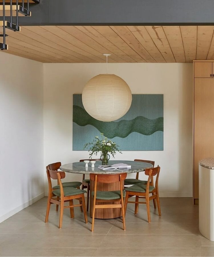
The globe is perhaps the most recognizable mid-century pendant shape: spherical, generous, and unambiguously modern. In a kitchen, a large globe in amber glass, opal white, or smoked tones hangs with quiet authority over an island or nook. The shape casts diffused light in all directions, which creates warmth without shadows.
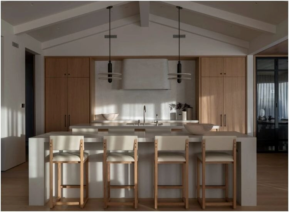
Cone
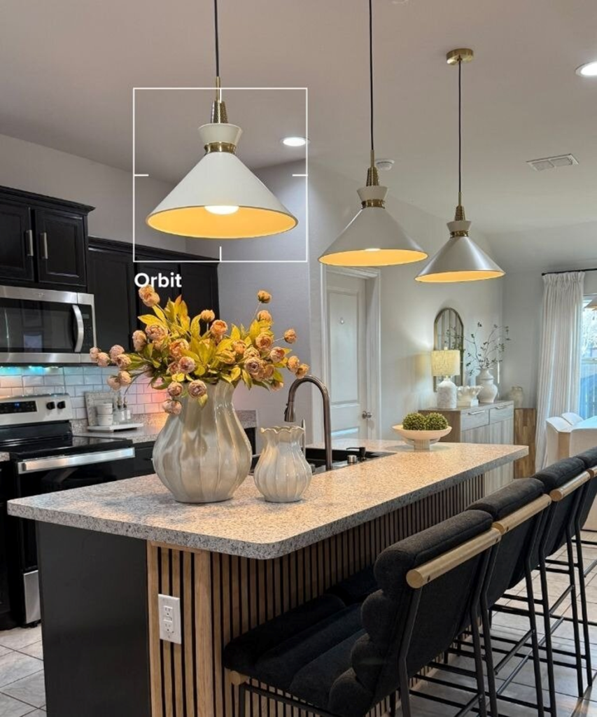
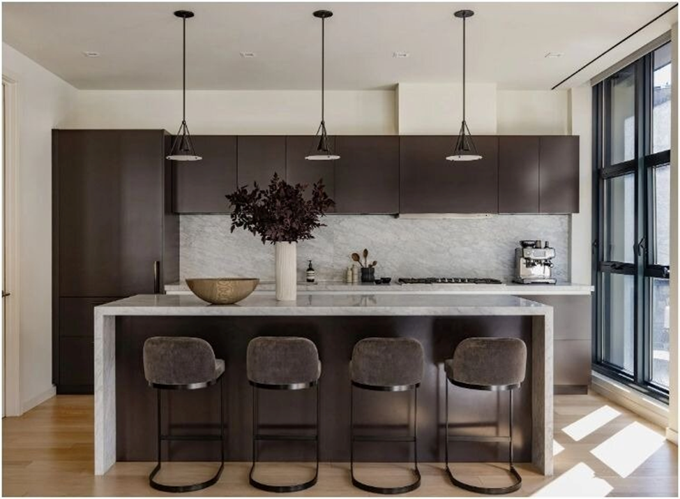
The cone shade is the working fixture of the mid-century canon, borrowed from industrial task lighting and elevated by its materials and proportions. A cone in spun brass or matte black is focused and directional; it illuminates the surface below without drawing attention to itself. Two or three cones in a line over a long island is a compositional move that reads as deliberate and graphic.
Dome
The dome sits between the globe and the cone. It’s hemispherical, generous in its light output, and clean in its silhouette. A rattan or woven dome brings the tactile warmth of natural fiber to a mid-century kitchen without abandoning the formal clarity the style requires. The shade’s organic texture is a counterpoint to the precision of the surrounding cabinetry.
Saucer and Mushroom
The saucer and mushroom forms are the more overtly sculptural options in the mid-century repertoire: UFO-like, space-age, and still entirely at home in a contemporary kitchen. These work best when used with restraint: one strong sculptural pendant rather than a row.
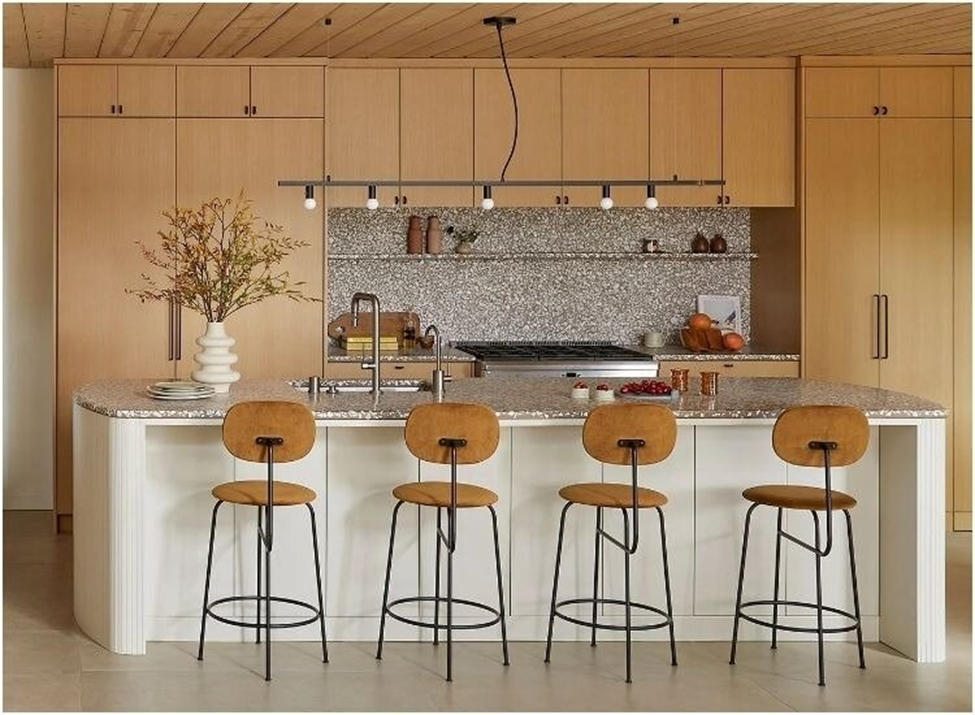
Multi-Light Linear Fixture
A linear chandelier or multi-light pendant bar, three or five pendants suspended from a single canopy or rail, creates a strong horizontal element that complements the linear geometry of most kitchens. This approach is particularly effective over long islands where a single fixture would feel undersized.
How to Match Pendant Lights With Cabinets and Finishes
The pendant finish should either echo a material already present in the kitchen or provide a considered contrast. Both approaches can work; the mistake is not choosing a finish that neither coordinates nor contrasts, but simply coexists without intention.
White or off-white cabinetry – this is the kitchen where contrast can be deployed most effectively. Matte black pendants against white cabinets create a graphic, high-contrast composition that reads as decisively modern. Alternatively, warm brass against white cabinetry adds warmth without darkness, a softer take on the same principle.
Walnut and warm wood cabinetry – here, brass is the natural partner. The amber tones of unlacquered brass and the warm grain of walnut belong to the same palette; together they create a kitchen that feels rich without being heavy. A cone or globe in warm brass above walnut cabinets is a pairing that has been right for sixty years and remains so.
Terrazzo and stone counters – terrazzo in particular is a mid-century material, and the flecks of color within it offer a starting point for pendant selection. A pendant in the dominant tone of the terrazzo, whether warm amber, cool grey, or earthy green, creates visual continuity across the room’s horizontal surfaces.
Matte black hardware – if the kitchen’s hardware is already matte black, the pendant should either match or offer a deliberate counterpoint in warm brass or natural fiber. Two matte-black elements in the same room read as a system; three or more can feel monochromatic unintentionally.
How Many Pendants Should You Use Over a Kitchen Island?
The number of pendants over an island is a proportionality question, not a preference question. The fixtures should cover the island’s length evenly: no crowding at the center, no emptiness at the ends.
Two pendants work well for islands up to approximately 72 inches. Position them at one-third and two-thirds of the island’s total length, centered over the counter rather than aligned with the edges. Two pendants in a mid-century kitchen often read as a considered pair, particularly if the shades are visually strong.
Three pendants suit islands between 72 and 96 inches. Even spacing, roughly every 24 to 30 inches, creates a rhythm that feels measured rather than crowded. For a long island, three cone or dome shades in a line are among the most compositionally satisfying pendant arrangements in contemporary kitchen design.
One pendant is appropriate for shorter islands under 48 inches, or when the fixture is large and sculptural enough to hold the full visual field on its own. A single 24-inch globe over a compact island reads as a deliberate choice; a single 14-inch pendant over the same island reads as an oversight.
Scale matters beyond number. A pendant that covers less than half the island’s total width, whether one fixture or several, will always read as undersized. The goal is visual anchoring: the pendants should feel like they belong to the island, not like they are floating above it independently.
Hang the bottom of the shade 30 to 36 inches above the countertop. This is the functional range that maintains sightlines across the island while keeping the light close enough to the surface to feel purposeful.
Common Mid-Century Kitchen Lighting Mistakes
Going too retro. Mid-century modern is not a costume. Fixtures that lean too heavily on period-accurate kitsch, such as orange globes, avocado green shades, and deliberately vintage proportions, read as nostalgic rather than considered. The best mid-century kitchen lighting borrows the vocabulary of the era and updates it: cleaner execution, better materials, more restrained application.
Choosing fixtures that are too small. This is the most common mistake when selecting kitchen pendants, regardless of style. A pendant that looks proportionate in a product photograph or a showroom often reads as undersized once installed above a real island in a real kitchen. When in doubt, go one size larger than instinct suggests.
Using the wrong bulb color temperature. A 5000K daylight bulb in a warm brass pendant fixture is a contradiction in terms. The fixture promises warmth; the bulb undermines it. Use 2700K-3000K warm-white bulbs in every mid-century kitchen pendant. The filament-style LED bulb, an elongated or globe shape with a visible element, is particularly well-suited to globe and cone shades where the bulb is at least partially visible.
Mixing finishes without a system. A kitchen with brass pendants, chrome faucet, matte black hardware, and brushed nickel cabinet pulls is not collected; it’s accumulated. Mid-century design has a strong point of view on material; bring that same clarity to the kitchen. Choose one or two metal finishes and apply them with intention. Every other finish in the room should either match or provide a considered contrast.
Conclusion
The mid-century modern kitchen pendant is not decoration; it is architecture at the scale of the fixture. The best examples feel inevitable: as though the kitchen could not have been designed any other way, as though removing the pendant would leave the room incomplete.
That standard, inevitability, is worth holding. Style and function are not competing considerations in a well-designed kitchen. They are, in the mid-century tradition, the same consideration.
