
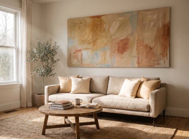
The living room is the most photographed, most lived-in room in most homes, yet the art on its walls is often the last thing anyone thinks about. People pick paint colors for months, agonize over the sofa fabric, then grab whatever canvas fits the budget on moving week. That’s changing in 2026. Homeowners are treating wall art as a real design decision rather than an afterthought, and the shift shows up in how they size, place, and choose pieces for the room where they spend the most time.
This guide walks through what’s actually driving that change, plus the practical rules that make a piece of art look intentional instead of accidental.
Why Wall Art Placement Matters More Than You Think
Art in the home isn’t just decoration; it also plays an important role in defining interior design styles and shaping how a living space feels. A 2025 Frontiers in Psychology study found that engaging with visual art activates brain regions tied to positive emotion, and the researchers linked that engagement to measurable stress reduction and better emotional regulation. That matters more in a living room than almost anywhere else in the house, since it’s where people unwind after work, host friends, and spend the bulk of their downtime. The art you choose isn’t just filling wall space; it shapes how the room feels every day.
Most people get the size and shape wrong. Designers lean on what’s often called the 2/3 rule: a piece of art should span roughly two-thirds of the width of the furniture beneath it. Above a standard sofa or console table, that almost always favors a horizontal orientation over a tall, narrow one. A single wide canvas fills the visual gap that portrait pieces leave on either side, which is exactly why so many homeowners searching for horizontal wall art for living room spaces are landing above their sofas rather than in a hallway or reading nook. It’s a format built for the proportions most living rooms actually have.
Once you know the shape you need, the rest of the room starts to fall into place around it.
The Big Shift: Statement Pieces Over Gallery Walls in 2026
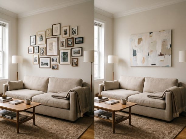
Gallery walls aren’t disappearing, but the multi-frame, fill-every-inch approach is losing ground to a single, oversized piece that does the visual work on its own. It’s a quieter look, and it’s also easier to get right, since one large canvas can’t be hung crooked relative to five other frames.
Broader design data backs this move toward bolder, more decisive choices. Homeowners are choosing fewer, more dramatic elements rather than filling every surface with small ones, and a single statement canvas is a maximalist move dressed up as restraint.
When a Gallery Wall Still Makes Sense
A gallery wall isn’t wrong for every room. If you’ve collected art over years, travel, or family milestones, a curated wall can tell a story that one canvas can’t. Eclectic spaces with mismatched furniture and layered textiles also tend to absorb a gallery wall better than minimalist rooms do. And if budget is tight, grouping pieces you already own costs nothing, while a single oversized statement piece usually means a bigger purchase.
Color and Texture Trends to Pair With Your Art
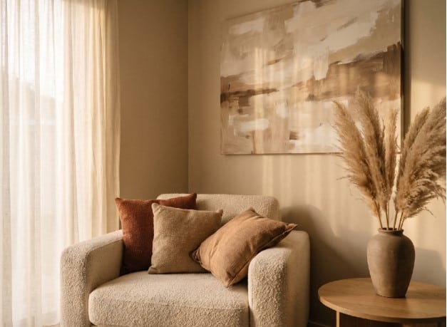
Warm neutral palettes are replacing cool grays in 2026 living room styling.
Cool grays dominated living rooms for most of the past decade. That’s fading now in favor of warmer, earthier tones, a shift that lines up with the same Frontiers in Psychology research linking a room’s visual environment to mood and stress levels. The same 1stDibs survey found designer interest in burgundy jumped from 7% in 2025 to 21% for 2026, part of a wider move toward deep browns, greens, and reds. Pair a horizontal canvas in one of those tones with a warm neutral wall, and the piece stops looking dropped in and starts looking built into the room.
Texture matters just as much as color here. A flat print on a stark white wall reads differently than the same image on a textured canvas surrounded by nubby throw pillows and a woven rug. If you’re already layering texture into a small living space with woven throws and nubby upholstery, adding art with visible brushstrokes or canvas texture can create the same tactile feeling found in a bohemian green couch living room instead of stopping at the furniture.
Sizing and Hanging Your Art Correctly
Here’s the math behind the 2/3 rule in practice. If your sofa is 84 inches wide, aim for a piece somewhere between 50 and 60 inches wide, which is squarely in horizontal canvas territory rather than a single tall portrait frame. Height matters too: center the artwork around 57 inches from the floor, which is roughly eye level for most adults standing in the room. Above a sofa specifically, leave 6 to 8 inches between the top of the sofa back and the bottom of the frame so the piece feels connected to the furniture rather than floating awkwardly above it.
For multi-piece arrangements, keep 2 to 3 inches between frames so the grouping reads as one composition instead of scattered pieces. This scale-to-the-room logic isn’t unique to art. It’s the same reasoning behind picking the right fixture scale for a room, where getting the diameter wrong makes a fan look either lost in a large room or oversized in a small one. Art works exactly the same way.
Renter-Friendly and No-Drill Options
Renters don’t have to skip the statement-piece trend just because a lease bans drilling. Oversized canvases can lean against a wall rather than hang from it, while complementary window treatments can add another layer of texture and visual balance to the living room. Command-strip picture ledges hold multiple lightweight frames without a single nail hole, and they let you rearrange pieces on a whim. Digital art frames are another option worth considering if you like rotating pieces seasonally without buying new canvases every few months.
These smaller, finishing touches that pull a renovated room together are often what separates a room that feels finished from one that still looks like a work in progress.
Choosing Art That Actually Fits Your Life
Picking wall art for 2026 isn’t about chasing every trend that shows up in a design magazine. It’s about proportion, warmth, and choosing pieces that support how the room actually gets used day to day. Measure your wall space before you shop, decide whether a bold single piece or a curated gallery fits your space and budget, and lean toward warm tones and real texture over whatever felt trendy five years ago.
Start with the measuring tape, not the catalog. Once you know the size and shape that actually fits your wall, the rest of the decision gets a lot easier.

